

Choosing a single paint color for a room can feel overwhelming. Choosing a cohesive color scheme that flows beautifully through your entire home? That can feel downright paralyzing.
If you are tired of your home feeling like a patchwork quilt of mismatched rooms, you are in the right place. In 2026, interior design has shifted away from stark, sterile grays and moved toward rich, organic, and comforting tones.
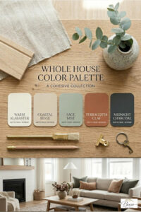
Below is our signature, designer-curated 2026 Whole House Paint Palette. This specific collection of colors is mathematically and visually balanced to ensure perfect room-to-room flow while maximizing natural light.
The Anatomy of a Perfect Whole House Color Scheme
To make a home feel professionally designed, your palette needs structure. You cannot simply pick five random colors you love; they must serve specific functions. A foolproof whole-house strategy relies on three categories:
-
The Anchor Neutral (60-70% of the home): Your main hallway, entryway, and open-concept living spaces.
-
The Secondary Soft Tone (20-30% of the home): Perfect for bedrooms, offices, or kitchens to create a subtle shift in mood.
-
The Statement Accent (10% of the home): Reserved for powder rooms, accent walls, built-ins, or front doors.
The 2026 Palette Breakdown
1. The Anchor: Warm Alabaster White
-
The Vibe: Crisp but comforting.
-
Where to use it: Entryways, hallways, open-concept living rooms.
-
This isn’t your standard rental-grade white. This shade features subtle yellow and gray undertones, ensuring it never feels clinical or cold, even under harsh LED lighting. It bounces natural light beautifully, making small spaces feel instantly larger.
2. The Secondary Base: Soft Mushroom Beige
-
The Vibe: Grounded, earthy, and sophisticated.
-
Where to use it: Kitchen cabinetry, dining rooms, or main bedroom walls.
-
Mushroom is the breakout neutral of the year. It sits perfectly on the fence between gray and beige (a true “greige”), offering an organic backdrop that pairs beautifully with natural wood tones and brass hardware.
3. The Tranquil Escape: Muted Sage Green
-
The Vibe: Biophilic, peaceful, and restorative.
-
Where to use it: Home office, primary bathroom, or cozy reading nook.
-
Bringing the outdoors in is a core pillar of modern design. This muted sage behaves like a neutral while injecting personality. It lowers the heart rate and creates a serene environment perfect for spaces dedicated to rest or focus.
4. The Cozy Contrast: Terracotta Clay
-
The Vibe: Warm, welcoming, and artisanal.
-
Where to use it: Dining room accent wall, laundry room, or front door.
-
To prevent a neutral home from feeling boring, you need warmth. This terracotta shade has a dusty, matte finish that feels deeply connected to nature. It acts as an incredible backdrop for gallery walls or woven rattan accents.
5. The Bold Grounding Element: Charcoal Iron Ore
-
The Vibe: Moody, modern, and high-contrast.
-
Where to use it: Fireplace surrounds, interior doors, trim, or a moody powder room.
-
Every light and airy home needs a touch of darkness to anchor the eyes. Using a deep charcoal on your interior doors or a media built-in adds instant architectural interest and luxury value to a standard build.
Pro-Tips for Perfect Room-to-Room Flow
-
Keep the Trim Consistent: The easiest way to tie a whole house together is to paint all trim, baseboards, and ceilings the exact same white throughout the entire house (even in rooms painted dark colors).
-
Test in Different Lighting: Light changes drastically from East to West. Paint large 2×2 test swatches on poster boards and move them around your rooms at 8 AM, 1 PM, and 8 PM before committing.
-
The 60-30-10 Rule: In any given room, keep 60% of the room your main color (usually walls), 30% your secondary color (furniture/textiles), and 10% your accent color (pillows, art, decor).
What do you think of this palette? Let us know in the comments below which room you are going to paint first!