
Disclosure: This post contains affiliate links. If you purchase through these links, I may earn a small commission at no extra cost to you. Thank you for supporting my blog! 💕
As the seasons transition and the frost of winter gives way to the gentle warmth of spring, our homes often call for a renewal that mirrors the world outside. The intersection of minimalist Japandi design and eclectic Bohemian style offers a unique sanctuary where function meets soul. While Japandi focuses on the Japanese principles of ‘wabi-sabi’ and Scandinavian ‘hygge,’ Boho introduces a layer of organic warmth and artistic freedom. Combining these two might seem contradictory at first, but they share a deep-rooted appreciation for natural materials and craftsmanship. By choosing specific Japandi color schemes, you can create a space that feels both curated and comfortable, providing a soft landing for your daily life.
Spring is the perfect time to explore this aesthetic because it emphasizes airiness and light. The ‘Scandi-Boho’ or ‘Japandi-Boho’ look relies heavily on a neutral foundation to prevent the mix of textures from feeling cluttered. When we talk about these palettes, we aren’t just talking about beige or white; we are discussing the subtle interplay of bone, oatmeal, slate, and sage. These tones act as a canvas that allows the architectural lines of Japanese furniture and the tactile nature of macramé or rattan to coexist in harmony. This blog post will guide you through seven expertly curated palettes that will help you achieve a sophisticated yet cozy spring refresh that stands the test of time and trend cycles alike.
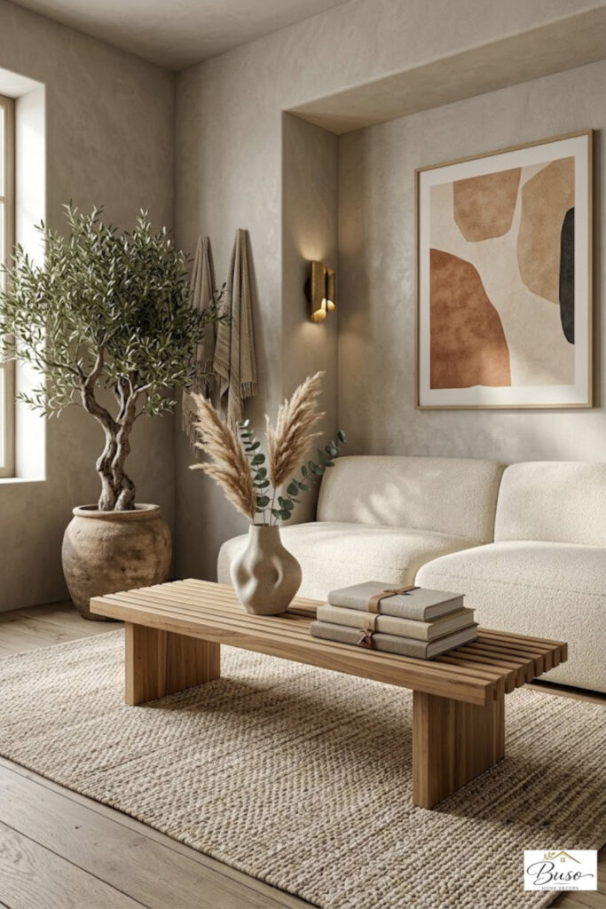
The Synergy of Minimalism and Bohemian Spirit
To understand why Japandi and Boho work so well together, one must look at their common denominator: the earth. Both styles reject the sterile, plastic-heavy interiors of late-twentieth-century modernism in favor of wood, stone, and cotton. However, where pure minimalism can sometimes feel cold, the Boho influence adds ‘the best color schemes’ involving warm undertones and rich textures. In this hybrid style, the minimalist side provides the structure, think low-profile platform beds and clean-lined cabinetry, while the Bohemian side provides the heart, through layered rugs, potted greenery, and handcrafted ceramics.
Integrating the best color schemes into this hybrid style requires a delicate balance. You want to maintain the ‘ma’ (negative space) found in Japanese design while embracing the lived-in feel of a Boho bungalow. This is achieved by sticking to a primary palette of neutrals but varying the ‘temperature’ of those neutrals. For instance, a cool gray wall might be offset by a warm terracotta pot or a golden-hued jute rug. This spring, the focus is shifting away from stark whites toward ‘mushy’ neutrals, colors that are hard to define, like a grey-green or a sandy-peach. These nuances make the space feel more organic and less like a showroom. By focusing on these subtle shifts, you can transform a room into a meditative retreat that still feels vibrant and full of personality. It is about creating a visual flow where the eye is never startled but always intrigued by the depth of the materials used.
7 Curated Palettes for Your Spring Refresh
Selecting the right Japandi color schemes is essential for setting the mood of your home.
- The first palette to consider is ‘The Whispering Oat.’ This involves a blend of creamy whites, pale oat, and a hint of light oak. It is the quintessential spring look, reflecting the maximum amount of natural light.
- Second, we have ‘Stone and Sage.’ By introducing a very desaturated green alongside slate grays, you bring the budding garden indoors without overwhelming the senses. This is one of the most beautiful color schemes for those who want a hint of color while remaining strictly neutral.
- The third palette, ‘Terracotta Sand,’ pulls from the Boho playbook by adding sun-baked clay tones to a backdrop of desert sand. It feels grounded and warm.
- Fourth is ‘Muted Charcoal and Linen.’ This uses high-contrast dark accents, common in Japanese design, against the softest off-white linen fabrics.
- Fifth, consider ‘The Golden Rye,’ which utilizes mustard undertones in textiles to mimic spring sunlight.
- The sixth option is ‘Dusty Rose and Ash,’ a sophisticated take on pink that feels earthy rather than floral.
- Finally, the seventh palette is ‘Driftwood and Bone,’ focusing on weathered wood tones and high-gloss ivory finishes.
- These beautiful color schemes provide a versatile framework. Whether you are repainting a focal wall or simply swapping out throw pillows, these combinations ensure that your space remains cohesive. Each palette encourages a sense of slow living, urging you to notice the way shadows fall across a textured wall or how a ceramic vase catches the morning light. They are designed to be timeless, ensuring your spring refresh feels relevant all year round.
Texture as a Color: Elevating the Palette
In a minimalist Boho home, texture often functions as its own color. When you work with perfect color schemes, the lack of bold pigments means the ‘interest’ must come from the physical surface of your items. A bouclé chair in a cream shade looks entirely different from a sleek leather chair in the same hue. To truly nail the Japandi-Boho fusion, you must layer these textures intentionally. Think of a smooth, blackened wood coffee table sitting atop a shaggy Berber rug. The contrast in feel creates a visual richness that replaces the need for bright colors.
Spring is the ideal season to introduce lighter textures like linen, hemp, and light-toned rattan. These materials naturally fit into the perfect color schemes we have discussed, as they carry their own organic pigments. A pampas grass arrangement, for example, adds a feathery silver-beige that complements a minimalist stone fireplace. Even the walls can contribute to this textural story through the use of lime wash or clay plaster, which gives a soft, chalky finish that interacts beautifully with light. When you limit your color palette, every tactile detail is amplified. The weave of a throw blanket or the grain of a wooden bowl becomes a focal point. This approach not only looks beautiful but also creates a sensory experience that promotes relaxation and mindfulness. It turns the act of ‘decorating’ into an exercise in curation, where every piece is chosen for its ability to contribute to the overall atmosphere of calm.
Implementing These Palettes in Your Space
Transitioning your home to reflect these Japandi color schemes does not require a complete renovation. Start by decluttering, this is the ‘Japandi’ requirement. Remove items that do not serve a purpose or bring joy. Once the space is cleared, look at your largest surfaces: walls and rugs. If your walls are a stark, cool white, consider warming them up with a coat of ‘greige’ or a soft bone paint. This immediately softens the room. Next, introduce Boho elements through your accessories. A set of hand-woven baskets or a collection of mismatched ceramic mugs can ground the minimalist architecture of the room.
The key to using these color schemes effectively is the 60-30-10 rule, but with a twist. Use your primary neutral for 60% of the room (walls and large furniture), a secondary natural material (like light wood or stone) for 30%, and your ‘accent’ neutral (like charcoal or sage) for the final 10%. This ensures that even without bright colors, the room has a clear hierarchy and depth. For spring, you might choose to increase the percentage of light-reflecting surfaces to make the most of the longer days. Mirrors with thin wooden frames or glass vases can help bounce light around, making these Japandi color schemes feel even more vibrant and airy. Remember that the goal is balance, not too much ‘stuff,’ but enough soul to make the house feel like a home. By being intentional with your choices, you create a space that supports your well-being.
Frequently Asked Questions
What is the main difference between Japandi and Boho?
Japandi is more structured, focusing on minimalism, clean lines, and functionality rooted in Japanese and Scandi design. Boho is more eclectic and relaxed, focusing on layers, patterns, and organic warmth. The fusion uses Japandi for the bones of the room and Boho for the soul and comfort.
Can I use dark colors in a Japandi-Boho room?
Yes, but they should be used sparingly as accents. Muted charcoal, deep espresso, or slate gray can provide ‘weight’ to a room and highlight the lighter neutrals, creating a sophisticated contrast that is very common in Japandi design.
How do I make a neutral room feel ‘warm’ for spring?
Focus on ‘warm’ neutrals like cream, sand, and beige rather than stark white. Add natural wood elements, plenty of indoor plants, and soft textiles like linen and cotton to create a cozy, inviting atmosphere.
Final Thoughts
The fusion of Japandi and Boho style offers a blueprint for a home that is both a sanctuary and a statement. By embracing Japandi color schemes, you move away from the frantic pace of modern trends and toward a more sustainable, intentional way of living. These palettes, ranging from the warmth of terracotta sand to the cool tranquility of stone and sage, provide the perfect backdrop for a spring refresh that feels both new and familiar.
As you integrate these colors into your living room, bedroom, or workspace, remember that the most successful interiors are those that reflect the people living within them. Use these neutral palettes as a starting point, but do not be afraid to add personal touches like heirlooms, plants, or art. The beauty of this design movement lies in its flexibility and its focus on harmony. By prioritizing light, texture, and natural tones, you can create a home that feels like a breath of fresh air this spring and for many seasons to come.
📌 Found this helpful? Save this pin to your Pinterest boards so you can refer back to it later!