
For the past decade, interior design was heavily dominated by cool, icy grays and stark, hospital-grade whites. While that era brought a sense of ultra-modern cleanliness, it often left homes feeling a bit chilly and uninviting. Today, we are witnessing a massive, beautiful shift in how we color our living spaces. Homeowners and designers are craving comfort, seeking out environments that wrap around them like a soft blanket at the end of a long day.
Enter the warm neutral whole house paint palette
This is not a return to the heavy, yellow-based builder beiges of the early 2000s. The new wave of warm neutrals is incredibly sophisticated, complex, and highly adaptable. By utilizing a carefully curated spectrum of soft beiges, elegant greiges, and grounded earthy tones, you can create a timeless, calming interior that flows effortlessly from your front door all the way to your back patio.
Whether your personal aesthetic leans toward sleek modern minimalism, collected boho chic, or transitional elegance, a warm neutral foundation is the absolute best way to ensure your home feels cohesive. In this extensive guide, we will break down exactly how to achieve this coveted color harmony, featuring specific, foolproof paint selections from both Sherwin-Williams and Benjamin Moore.
Why Warm Neutrals Are the Ultimate Design Foundation
Before we dive into the specific paint cans, it is vital to understand the “why” behind this color strategy. Why are warm neutrals so universally flattering, and why do they make a house feel so much more like a home?
The secret lies in color psychology and light reflection. Cool colors, those with blue, purple, or green undertones, tend to recede visually, which can make a room feel expansive but also detached and cold. Warm colors, those rooted in yellow, red, or brown undertones, visually advance toward the eye. When you use muted, neutral versions of these warm tones, they gently embrace the room, creating an atmosphere of safety, relaxation, and intimacy.
Furthermore, a warm neutral palette is the ultimate chameleon. If you are someone who loves to change out your throw pillows, rugs, and artwork every season, a warm neutral backdrop will support those changes beautifully. A soft greige wall looks equally stunning behind a vibrant, bohemian rust-colored sofa as it does behind a sleek, minimalist white boucle chair. It is the perfect bridge between different design styles, making it an incredibly smart, long-term investment for your walls.
Understanding Lighting in a Warm Neutral Home
One of the most critical elements to consider when painting with warm neutrals is your home’s natural lighting. A color that looks perfectly creamy in one room might look muddy in another.
Rooms that face North receive cooler, bluer natural light. In these spaces, you need to rely on the warmer end of your palette, leaning into beiges and soft creams to counteract the chilly light. Rooms that face South receive intense, warm, golden light throughout the day. In these sun-drenched spaces, you can comfortably use the “greige” tones in your palette, as the sun will naturally warm up any slight gray undertones.
By utilizing a whole-house palette, you have a cohesive family of colors at your disposal, allowing you to select the perfect shade for each specific room’s lighting while ensuring the entire house remains harmonious.
The Core Warm Neutral Color Palette
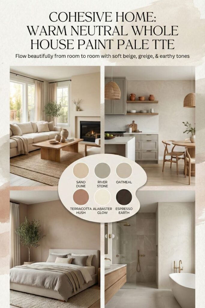
To achieve that magazine-worthy, seamless flow, we have curated a collection of six essential colors. These hues range from bright and luminous to deep and grounding, giving you all the tools you need to paint a deeply layered, timeless home.
1. The Luminous Base, Soft Creamy White
Every harmonious palette needs a bright, reflecting color to provide visual breathing room. For a warm neutral home, you must avoid harsh, glaring whites. Instead, opt for a soft, creamy white that feels gentle on the eyes and provides a warm glow.
- Sherwin-Williams Pick, Greek Villa (SW 7551). This is a beautifully soft, sunny white with very subtle beige undertones. It manages to look crisp without ever feeling sterile, making it a fantastic choice for dimly lit spaces.
- Benjamin Moore Pick, White Dove (OC-17). This is arguably the most famous soft white in the design world. It is incredibly luminous and features just a whisper of greige, ensuring it pairs flawlessly with deeper earthy tones.
2. The Versatile Anchor, The Perfect Greige
This is the workhorse of your palette. The perfect greige, a masterful blend of gray and beige, will cover the majority of your open living spaces. It provides enough depth to make your white trim pop, but remains light enough to keep your home feeling airy and open.
- Sherwin-Williams Pick, Accessible Beige (SW 7036). Despite the name, this is a phenomenal greige. It sits right on the fence between warm and cool, making it one of the most adaptable and widely loved neutrals on the market.
- Benjamin Moore Pick, Pale Oak (OC-20). A truly elegant, sophisticated color. It is a very light taupe-greige that brings a sense of refined calm to expansive walls, perfect for modern and minimalist interiors.
3. The Cozy Mid-Tone, Earthy Taupe
To add depth and character without committing to a dark color, a mid-tone earthy taupe is essential. This color is richer than your greige anchor and looks spectacular in rooms where you want to create a slightly more intimate, cozy atmosphere.
- Sherwin-Williams Pick, Shiitake (SW 9173). A warm, stone-like neutral. It has a beautiful, organic quality that evokes images of river rocks and natural clay, making it a great fit for boho-inspired spaces.
- Benjamin Moore Pick, Smokey Taupe (983). A highly complex color that shifts throughout the day. It provides a gorgeous, velvety backdrop that makes warm wood furniture and brass accents absolutely sing.
4. The Grounding Dark, Warm Charcoal-Brown
A room without contrast can quickly feel flat and uninteresting. To anchor your warm neutrals, you need a deep, dramatic color. However, pure black is too harsh for this serene palette. Instead, use a deeply saturated, warm charcoal that borders on brown.
- Sherwin-Williams Pick, Urbane Bronze (SW 7048). A rich, sophisticated dark hue that is rooted in nature. It looks phenomenal on interior doors, kitchen islands, or as a striking accent wall in a minimalist bedroom.
- Benjamin Moore Pick, Midsummer Night (2134-20). A breathtaking, nearly-black brown. It provides all the necessary drama and contrast of a dark color, but with a foundational warmth that keeps it harmonious with the lighter beiges.
5. The Organic Accent, Muted Mushroom
To bridge the gap between your light greiges and your dark bronze, a muted, fleshy mushroom color adds a layer of bespoke, high-end design to your home. It is unexpected, incredibly chic, and adds a subtle touch of color without breaking the neutral rules.
- Sherwin-Williams Pick, Jogging Path (SW 7638). A slightly deeper, earthier greige with a very faint, almost imperceptible green undertone. It feels deeply tied to the natural world.
- Benjamin Moore Pick, Grant Beige (HC-83). A traditional, solid mid-tone beige that brings an immediate sense of history and timelessness to a modern home, grounding the space beautifully.
6. The Architectural Highlight, Clean Warm Trim
Finally, to define your architecture, you need a trim color. You want a white that is bright enough to frame your wall colors, but warm enough to blend with the overall aesthetic.
- Sherwin-Williams Pick, Alabaster (SW 7008). A gorgeous, warm-leaning white that lacks the starkness of a pure modern white, making it the perfect trim choice for an earthy palette.
- Benjamin Moore Pick, Simply White (OC-117). A clean, crisp white with just the tiniest drop of yellow in its formula, giving it a sun-kissed radiance that highlights baseboards and crown molding beautifully.
Room-by-Room Strategy for Seamless Flow
Now that you have your six core colors, the secret to a professional-looking home is knowing exactly where to apply them. Here is a strategic guide to painting your house for maximum color harmony.
Creating Flow in Living Rooms and Open Spaces
Your primary living areas, entryways, and connecting hallways should utilize the lighter, highly versatile colors in your palette. Paint these main walls using your Versatile Anchor (Perfect Greige). This creates a continuous, unbroken line of sight that makes the entire house feel larger and more connected. If you have an open-concept floor plan, rely on rugs and furniture groupings to define the spaces, while letting the cohesive wall color provide the unifying background.
Designing a Timeless, Earthy Kitchen
The all-white kitchen is a classic, but a warm neutral kitchen is the pinnacle of current design. For a timeless yet incredibly stylish look, paint your kitchen cabinetry in your Cozy Mid-Tone (Earthy Taupe). This softer approach to cabinetry hides scuffs better than white and feels much more customized. Keep the kitchen walls in your Luminous Base (Creamy White) to maintain a bright, functional cooking space. Ground the entire room by painting the kitchen island in your Grounding Dark (Warm Charcoal-Brown).
Crafting a Calming Bedroom Retreat
Your bedroom should be the ultimate sanctuary, a place to decompress and recharge. This is the perfect space to use your Organic Accent (Muted Mushroom) or your Cozy Mid-Tone (Earthy Taupe) on all four walls. Wrapping the room in a slightly deeper, warmer neutral creates a “cocooning” effect that is highly conducive to sleep. For a minimalist approach, keep the bedding simple and crisp white, allowing the warm walls to provide all the necessary texture and interest.
Warming Up Bathrooms and Utility Spaces
Bathrooms are full of hard, reflective surfaces, tile, glass, mirrors, and porcelain. This can easily make them feel cold and clinical. Counteract this by painting the walls in your Versatile Anchor (Perfect Greige). For a truly designer touch in a small powder room, take a risk and paint the walls, ceiling, and trim in your Grounding Dark (Warm Charcoal-Brown). Paired with a warm brass mirror and amber lighting, it creates an unforgettable, moody, and highly elegant space.
Styling Your Warm Neutral Home
The beauty of a warm neutral paint palette is that it serves as the perfect canvas for texture. Because the colors are quiet, your materials need to speak up.
In a modern minimalist home, focus on architectural shapes and luxurious, understated fabrics. Boucle accent chairs, smooth linen sofas, and honed marble coffee tables look exceptionally beautiful against greige and taupe walls.
For a boho-inspired space, layer your textures heavily. Bring in vintage, faded Turkish rugs featuring soft terracottas and muted greens. Add woven rattan light fixtures, natural pampas grass in ceramic vases, and heavily textured, chunky knit throw blankets.
When it comes to hardware and metals, unlacquered brass, aged bronze, and polished nickel are the best companions for warm neutrals. Avoid stark, polished chrome, as its icy blue undertones will clash with the earthy warmth of your fresh paint.
Designing a home that feels both stylish and perpetually calming does not require loud colors or complicated patterns. By embracing this warm neutral whole house paint palette, you are building a foundation of timeless color harmony. These carefully selected tones from Sherwin-Williams and Benjamin Moore will ensure that your home remains a peaceful, cohesive, and beautiful haven for decades to come.