
When it comes to interior design, homeowners often find themselves caught in a frustrating tug-of-war. On one hand, you want a home that feels “timeless”, a space that will look just as elegant and relevant ten years from now as it does today. No one wants to repaint their entire house every three years just to keep up with shifting fads. On the other hand, you want a home that feels “trendy”, a space that is fresh, current, and deeply stylish, rather than feeling stuck in a bygone era.
Is it possible to have both? Can a home be anchored in classic elegance while still feeling utterly modern?
The answer is yes, and the secret lies entirely in your color palette. By strategically combining time-tested foundational colors with carefully selected, trend-forward accent hues, you can create a whole-house color harmony that feels incredibly effortless. Whether your personal style leans toward modern minimal, boho chic, or classic elegance, this curated “Timeless & Trendy” paint palette will guide you toward seamless room-to-room coordination.
Let’s dive into the exact colors, featuring specific recommendations from both Sherwin-Williams and Benjamin Moore, that will help you build a cohesive, beautiful, and highly adaptable home.
The Philosophy: Bridging the Gap Between Classic and Current
The biggest mistake people make when painting a house is treating each room as an isolated island. They paint the kitchen bright white because it’s “classic,” then paint the living room a trendy dark emerald, and the hallway a builder-grade yellow-beige. The result is a disjointed home that feels jarring to walk through.
A harmonious whole-house palette acts as a unifying thread. To achieve the “Timeless & Trendy” balance, we use the 60-30-10 rule across the entire floor plan:
- 60% Timeless Foundation: This is the dominant color of your home. It goes on the main walls, hallways, and open-concept spaces. It must be a chameleon color that never goes out of style.
- 30% Grounding Classics: These are secondary colors used on cabinetry, interior doors, trim, or larger enclosed rooms (like a master bedroom). They have historical roots but feel sophisticated today.
- 10% Trendy Accents: This is where you have fun. These are the current, highly sought-after colors used in powder rooms, accent walls, painted furniture, or specific architectural niches.
By keeping the trendy colors isolated to easily changeable areas and relying on timeless hues for the heavy lifting, your home will always feel chic and up-to-date.
The Core Timeless & Trendy Color Palette
To achieve this seamless flow, you need a curated selection of six versatile colors. Here is the ultimate palette to bridge the gap between classic design and modern trends.
1. The Timeless Foundation: The Perfect Greige
For the main connective tissues of your home (entryways, hallways, and open living spaces), you need a color that is warmer than a stark, modern gray, but cooler than a dated, 1990s yellow-beige. Enter the perfect “greige.” This color adapts to any lighting condition and serves as the ultimate blank canvas for both classic antiques and modern minimalist furniture.
- Sherwin-Williams Pick: Agreeable Gray (SW 7029). This is one of the most popular paint colors in the world for a reason. It is incredibly balanced, leaning slightly warm, making spaces feel inviting but exceptionally clean.
- Benjamin Moore Pick: Revere Pewter (HC-172). A true classic from their historical collection. It is an earthy, grounding greige that adds immediate sophistication to expansive walls without ever feeling heavy.
2. The Luminous Neutral: Soft Cream
You cannot have a timeless home without a beautiful off-white. However, pure, icy whites can feel too sterile and contemporary. A soft, luminous cream provides that trendy “warm minimalist” look while remaining deeply classic. Use this for your living room walls, kitchen uppers, or anywhere you want to reflect natural light.
- Sherwin-Williams Pick: Swiss Coffee (SW 7012). A warm, welcoming white with just the right amount of creamy undertones. It creates a soft, diffused glow in a room.
- Benjamin Moore Pick: White Dove (OC-17). The holy grail of white paints. It is soft, shaded, and incredibly elegant, providing a crisp look that never feels cold or clinical.
3. The Classic Contrast: Tailored Navy
Navy blue is the interior design equivalent of a tailored blazer. It is undeniably timeless, yet it is currently having a massive trendy resurgence in modern homes. Navy provides excellent depth and contrast against your greige and cream foundation without the harshness of stark black.
- Sherwin-Williams Pick: Indigo Batik (SW 7602). A dusty, slightly muted navy that feels incredibly organic. It looks phenomenal on kitchen islands, built-in bookshelves, or as a dining room backdrop.
- Benjamin Moore Pick: Hale Navy (HC-154). A deeply saturated maritime blue that shifts beautifully throughout the day. It pairs flawlessly with brass hardware and natural wood tones.
4. The Trendy Pop: Muted Terracotta
If you want to inject a sense of “right now” into your home, earthy, baked-clay tones are the way to go. Terracotta brings a massive dose of warmth and a slightly bohemian, worldly vibe to a space. Because we are choosing a muted version, it feels sophisticated rather than loud.
- Sherwin-Williams Pick: Cavern Clay (SW 7701). A warm, sun-washed color that looks incredible against crisp white trim and lots of indoor greenery.
- Benjamin Moore Pick: Audubon Russet (HC-51). A rich, spiced hue that straddles the line between rust, brown, and burnt orange. It is the perfect trendy accent for a modern space.
5. The Elevated Accent: Soft Sage Green
Green is currently dominating interior design trends, representing a societal shift toward bringing nature indoors. A soft, silvery sage acts as a highly elevated neutral. It is calming, universally appealing, and bridges the gap between the cool navy and the warm terracotta in this palette.
- Sherwin-Williams Pick: Clary Sage (SW 6178). A muted, herbal green with just enough gray to keep it from looking minty. It is incredibly soothing.
- Benjamin Moore Pick: October Mist (1495). A gently shaded botanical green that feels like the stem of a flower. It provides a subtle wash of color that feels very contemporary.
6. The Crisp Trim: Pure White
To make the subtle undertones of your greige, cream, and sage walls truly pop, your trim, baseboards, ceilings, and interior doors need a clean, defining edge.
- Sherwin-Williams Pick: High Reflective White (SW 7757). A remarkably clean, bright white that provides incredible contrast without pulling any hidden yellow or blue undertones.
- Benjamin Moore Pick: Chantilly Lace (OC-65). Known as one of their purest whites, it is crisp, clean, and acts as the perfect architectural highlighter.
Room-by-Room Guide: Designing with Purpose
Having the right colors is only step one; knowing where to put them ensures that your home flows effortlessly. Here is how to apply this Timeless & Trendy palette across your floor plan.
The Entryway and Living Spaces
Keep your main living areas open, airy, and timeless. Use your Timeless Foundation (Greige) or your Luminous Neutral (Soft Cream) on the main walls. This provides maximum flexibility for your furniture and decor. To inject a trendy element, paint your interior front door in the Classic Contrast (Tailored Navy) and use the Crisp Trim (Pure White) on the baseboards to frame the space beautifully.
The Kitchen
The kitchen is the heart of the home and an excellent place to balance these styles. For a look that will look good for decades, paint your perimeter cabinets in the Luminous Neutral (Soft Cream). To bring in a current, trendy edge, paint the kitchen island in the Elevated Accent (Soft Sage Green) or the Classic Contrast (Tailored Navy). Pair this with timeless Carrara marble countertops and trendy, unlacquered brass hardware.
The Dining Room
Dining rooms are meant for gathering, conversation, and warmth. This is the perfect space to use your Trendy Pop (Muted Terracotta). Painting a dining room in this rich, spiced hue creates an intimate, glowing atmosphere for evening meals. If you have wainscoting or a chair rail, paint the bottom half in the Crisp Trim (Pure White) and the top half in the Terracotta to ground the bold color in traditional architecture.
The Bedrooms
Bedrooms should be restful retreats. The Elevated Accent (Soft Sage Green) is highly recommended for master suites. It lowers the heart rate and feels like an upscale boutique hotel. For children’s rooms or guest rooms, the Timeless Foundation (Greige) acts as a perfect backdrop for easily interchangeable, colorful bedding and art.
The Bathrooms
Bathrooms, especially powder rooms, are where you can take the biggest design risks. A small powder room painted floor-to-ceiling in the Classic Contrast (Tailored Navy), paired with a sleek, modern gold mirror and warm ambient lighting, feels incredibly chic and expensive. For a master bathroom, stick to the Luminous Neutral (Soft Cream) on the walls with Soft Sage Green on the bathroom vanity for a spa-like environment.
Adapting the Palette to Your Personal Style
The beauty of this specific color harmony is its extreme adaptability. Depending on your furniture and textiles, these exact same six paint colors can be pushed toward completely different aesthetic directions.
For Modern Minimalists: Focus heavily on the Greige, Cream, and Pure White. Use the Navy sparingly as a stark, defining contrast (perhaps on interior doors or a single piece of statement furniture). Keep lines clean, avoid clutter, and let the subtle interplay of the neutral walls speak for themselves.
For Boho Chic Lovers: Lean into the Terracotta, Sage Green, and Soft Cream. These colors naturally complement the rattan, jute, macramé, and natural wood textures inherent in bohemian design. The earthy tones of the paint will highlight your indoor plant collection and vintage Persian rugs perfectly.
For Classic Elegance: Rely on the Greige, Navy, and Pure White. These are the foundational colors of traditional design. Use the Terracotta and Sage only in very small doses, perhaps through artwork or throw pillows, to keep the space feeling current without sacrificing the tailored, classic foundation.
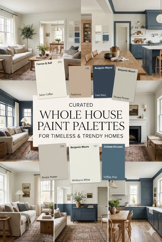
Creating a home that is both trendy and timeless is an art form, but with the right whole-house color palette, it is entirely achievable. By using these carefully curated shades from Sherwin-Williams and Benjamin Moore, you are investing in a cohesive, beautiful backdrop that will support your evolving style for years to come.