
For years, the interior design world has been dominated by stark white walls, pale gray floors, and ultra-bright, clinical spaces. But the tide has turned. Today, homeowners and designers alike are craving spaces that feel enveloping, sophisticated, and deeply personal. Enter the “Moody Modern” aesthetic, a design style that embraces rich, saturated hues, strategic shadows, and a dramatic sense of coziness.
If you are tired of playing it safe with builder-grade beige and want to infuse your home with character, a moody modern whole-house color palette is the perfect solution. But transitioning to dark colors can be intimidating. How do you make a house feel moody without making it feel like a cavern? How do you ensure the rooms flow seamlessly into one another?
The secret lies in color harmony. A curated whole-house paint palette ensures that every room, from the kitchen to the guest bathroom, speaks the same visual language. In this comprehensive guide, we are breaking down the ultimate Moody Modern color palette, featuring exact paint matches from both Sherwin-Williams and Benjamin Moore, along with a detailed room-by-room guide to transforming your home.
The Philosophy Behind “Moody Modern”
Before we dive into the exact paint swatches, it is important to understand what makes a space feel “moody modern.” This aesthetic is not simply about painting a room black and calling it a day. It is a highly intentional balancing act.
Moody refers to the emotional depth of the space. It utilizes dark, desaturated colors that absorb light rather than reflect it. These colors create an atmosphere of intimacy, grounding the room and making the walls recede, which ironically can make small spaces feel much larger.
Modern refers to the execution. To prevent a dark room from feeling like a Victorian haunted house, the architecture, furniture, and styling must remain sleek and contemporary. Clean lines, minimalist silhouettes, organic textures (like raw wood and leather), and sculptural lighting are essential to keeping the heavy colors feeling fresh and updated.
When building a whole-house palette, you need a foundation of deep neutrals, a few complex accent colors, and a balancing light tone to give the eye a place to rest. Let’s look at the exact colors that make up this harmonious palette.
The Core Moody Modern Color Palette
To achieve a cohesive flow, limit your home’s primary palette to five or six carefully chosen colors. Here is the perfect recipe for a Moody Modern home, complete with specific recommendations from the industry’s top paint brands.
1. The Deep Foundation: Soft Charcoal
Every moody home needs an anchor. Instead of a harsh, pure black (which can feel stark and cold), you want a soft, dusty charcoal. This color acts as a neutral backdrop that makes the warm tones of wood furniture and brass lighting absolutely glow.
- Sherwin-Williams Pick: Iron Ore (SW 7069). This is an iconic, deeply saturated charcoal that has a very subtle warm undertone. It is incredibly sophisticated and never looks like a flat, standard black.
- Benjamin Moore Pick: Wrought Iron (2124-10). A gorgeous, muted black with a hint of gray and navy undertones. It feels velvety on the walls and brings massive architectural interest to plain rooms.
2. The Grounding Green: Deep Forest
Green is nature’s ultimate neutral, and in a moody palette, a dark, muddy green brings the outdoors inside while maintaining a high level of drama. It bridges the gap between warm and cool tones seamlessly.
- Sherwin-Williams Pick: Pewter Green (SW 6208). A cool, dark, and calming green with strong gray undertones. It is elegant, grounded, and looks spectacular against bright white marble or light oak floors.
- Benjamin Moore Pick: Essex Green (HC-188). One of their historical colors, this is a very dark, nearly black forest green. It is rich, luxurious, and commands attention in any space.
3. The Atmospheric Blue: Desaturated Navy
Blue is a classic, but for a modern moody vibe, you must avoid anything too bright or primary. You are looking for a blue that has been heavily subdued with gray or black, a color that looks like the sky just after a thunderstorm.
- Sherwin-Williams Pick: Naval (SW 6244). A deep, confident navy that borders on black in low light. It is incredibly versatile and brings a sense of tailored maturity to a room.
- Benjamin Moore Pick: Hale Navy (HC-154). Arguably the most famous navy paint in existence, and for good reason. It has a perfect balance of cool and warm undertones, making it a foolproof choice for cabinetry and accent walls.
4. The Warm Neutral: Earthy Taupe/Mushroom
You cannot paint every single wall in your house dark. You need a transitional color for hallways, open-concept spaces, or rooms that lack natural light. Instead of a cool gray, opt for a warm, earthy taupe or “mushroom” color that maintains the moody depth without the heavy saturation.
- Sherwin-Williams Pick: Moth Wing (SW 9174). A beautiful, warm taupe that leans heavily into beige without ever looking yellow. It feels organic and soft.
- Benjamin Moore Pick: Pashmina (AF-100). An incredibly complex color that shifts between gray, beige, and a hint of olive depending on the lighting. It is the ultimate sophisticated neutral.
5. The Rich Accent: Muted Plum/Aubergine
To give your whole-house palette a touch of unexpected luxury, introduce a deep, dusty purple or burgundy. This provides a subtle pop of color that feels romantic and highly bespoke.
- Sherwin-Williams Pick: Blackberry (SW 7577). A dramatic, dark eggplant color that is dripping with luxury. It pairs beautifully with both the charcoal foundation and the earthy taupe.
- Benjamin Moore Pick: Shadow (2117-30). A former Color of the Year, this is a masterfully crafted rich amethyst that fades into a soft charcoal in the shadows.
6. The Crisp Contrast: Creamy Off-White
Even a moody house needs white for ceilings, trim, and doors (unless you are color-drenching, which we will discuss later). The key is to avoid blinding, hospital-bright whites, which will look glaring and harsh against your dark walls. Choose an off-white with warm undertones.
- Sherwin-Williams Pick: Alabaster (SW 7008). A warm, creamy white that offers just enough brightness without feeling clinical.
- Benjamin Moore Pick: White Dove (OC-17). A designer favorite. It is luminous, soft, and has almost imperceptible warm greige undertones that make it the perfect companion for dark, moody colors.
Room-by-Room Guide: Applying the Palette
Now that you have your six colors, how do you distribute them throughout the house so it feels cohesive but not repetitive? Here is a room-by-room strategy.
The Entryway & Hallways
Your entryway sets the tone for the entire house. For a dramatic first impression, consider painting the entryway in your Deep Foundation (Charcoal). Because people only pass through this space, you can afford to go intensely dark. To balance the darkness, use the Warm Neutral (Taupe) in the connecting hallways to give the eye a break and create a sense of expansion as you move into the main living areas.
The Living Room
The living room should be a sanctuary, a place to unwind and relax. If you have plenty of natural light, the Atmospheric Blue (Navy) or Grounding Green (Forest) are excellent choices for the main walls.
Pro Tip: Try “Color Drenching.” Instead of painting the walls green and leaving the baseboards and crown molding white, paint everything, walls, trim, doors, and even the ceiling, in the exact same dark color. This erases the visual boundaries of the room, creating an incredibly modern, enveloping space that feels like a cozy velvet box.
The Kitchen
The kitchen is where a moody palette truly shines. Two-toned kitchens are highly effective here. Paint your lower cabinets in the Deep Foundation (Charcoal) or Grounding Green (Forest) to ground the space. For the upper walls and any open shelving, use your Warm Neutral (Taupe) or Crisp Contrast (Off-White) to keep the room feeling airy and functional for cooking. Pair the dark lower cabinets with unlacquered brass hardware and a heavily veined marble countertop for a show-stopping modern look.
The Bedroom
Your bedroom should promote rest and tranquility. The Rich Accent (Plum) or the Atmospheric Blue (Navy) are perfect for a moody sleep sanctuary. If painting the whole room feels too heavy, consider creating a striking focal point by painting the wall behind your bed, and wrapping the color up onto the ceiling directly above the bed to create a canopy effect, while keeping the remaining walls in your Warm Neutral (Taupe).
The Bathroom / Powder Room
Powder rooms are the perfect place to experiment with extreme drama. Because they are small and often lack windows, fighting to make them bright is a losing battle. Lean into the darkness. Paint the entire room, ceiling included, in the Deep Foundation (Charcoal). Add a striking, oversized gold mirror, warm amber wall sconces, and a dark stone vanity. The result is a jewel-box of a room that will leave your guests speechless.
The Secret to Moody Walls: Sheen and Lighting
When working with dark paint colors, the finish of the paint is just as important as the color itself.
Dark colors show imperfections in the drywall much more easily than light colors. Therefore, you must avoid glossy finishes on your walls.
- For Walls: Always choose a Flat or Matte finish. Matte dark paint absorbs light beautifully, creating a rich, velvety texture that looks high-end and luxurious.
- For Trim, Doors, and Cabinets: Use a Satin finish. This provides durability and just enough subtle sheen to reflect light and create a slight contrast against the matte walls, even if you are painting them the exact same color.
Lighting is your best friend. A dark room with a single, harsh overhead light will look depressing. A moody modern room relies on layered lighting. You need ambient light (a statement chandelier on a dimmer), task lighting (reading lamps), and accent lighting (picture lights highlighting artwork, or wall sconces casting warm pools of light against the dark paint). Always use bulbs with a warm color temperature (around 2700K) to bring out the rich undertones of the paint.
Styling Your Moody Modern Home
The paint is only half the battle. To pull off the Moody Modern aesthetic, your furnishings must complement the walls.
- Warm Up the Woods: Dark walls look spectacular against warm, mid-tone woods like walnut, teak, and white oak. Avoid woods that are too dark (like espresso) as they will get lost against the walls, or woods that are too orange/red, which will clash with the sophisticated tones.
- Embrace Heavy Textures: Because the walls are dark, you need to introduce physical texture to create interest. Think chunky knit throw blankets, velvet pillows, bouclé accent chairs, and distressed vintage Persian rugs.
- Reflective Surfaces: Incorporate elements that bounce light around the room. Large floor mirrors, glass coffee tables, and metallic accents (especially aged brass, brushed gold, and matte black) are essential to keeping the space feeling dynamic.
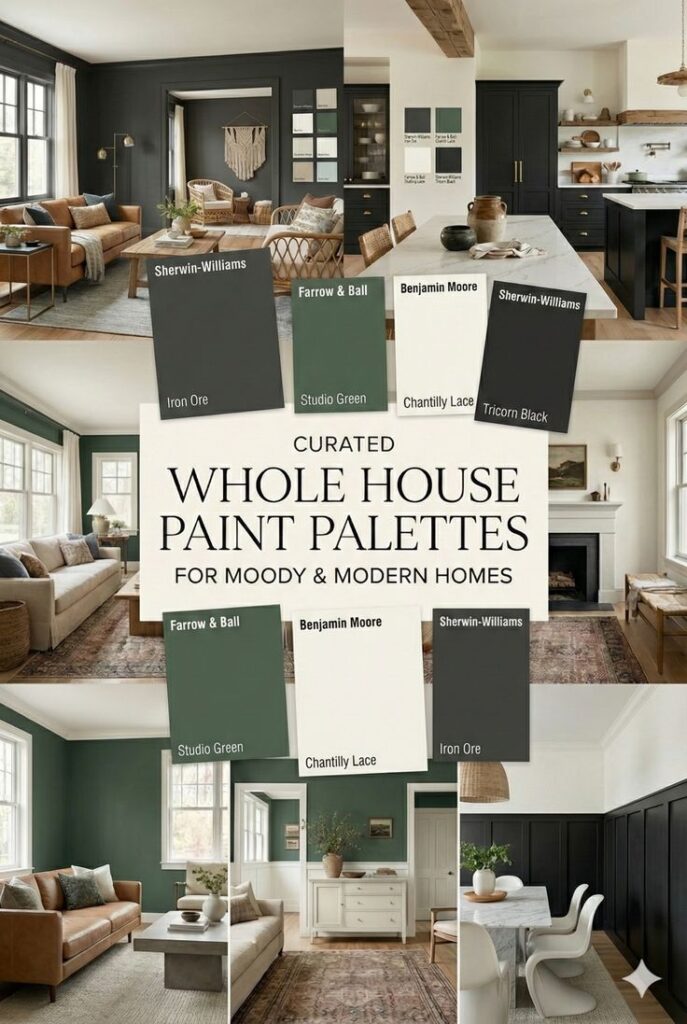
Creating a cohesive, moody home doesn’t happen by accident. It requires a thoughtful, curated approach to color. By utilizing these deep, sophisticated tones from Sherwin-Williams and Benjamin Moore, and distributing them carefully from room to room, you can transform your house into a dramatic, modern sanctuary that feels entirely your own.